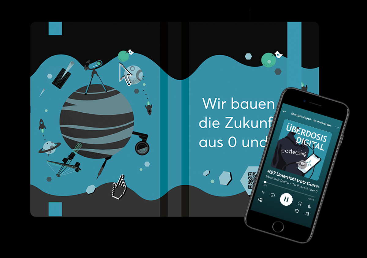
Along with the new design for the website of CodeCamp:N it was also my task to redesign the whole CD of the company. I am very happy to have been entrusted with this task.
The original CD was limited to the four blue colors of the four honeycombs of the logo. I added an accent color to this and further gradations in blue, black and gray. The future CD should now get its recognition value in the contrasts of blue, black and green.

The face of the company was to change from a young startup to a more serious image. Accordingly, I also adjusted the typography and decided to no longer write headlines in capitals. This also made the look more streamlined and modern. A mixture of hard edges and soft shapes reflects the assertive character of the employees without becoming too rigid.